BalONcesto TV
Complete redesign of the platform that streams the FEB's games
- For
- Sportway · Spanish Basketball Federation
- Role
- Product Designer
- Team
- Design from the FEB; development by Sportway
- Tools
- Figma
- When
- 2026
Context
BalONcesto TV is the platform that streams the games of almost every Spanish Basketball Federation (FEB) competition. It came out of an agreement between the Federation and Sportway, which provides the technology.
Since I joined the FEB, we've launched several products with a shared visual style: the Digital Scoresheet, the competitions website and the LF Endesa website. BalONcesto TV, on the other hand, looked nothing like them.
What was wrong
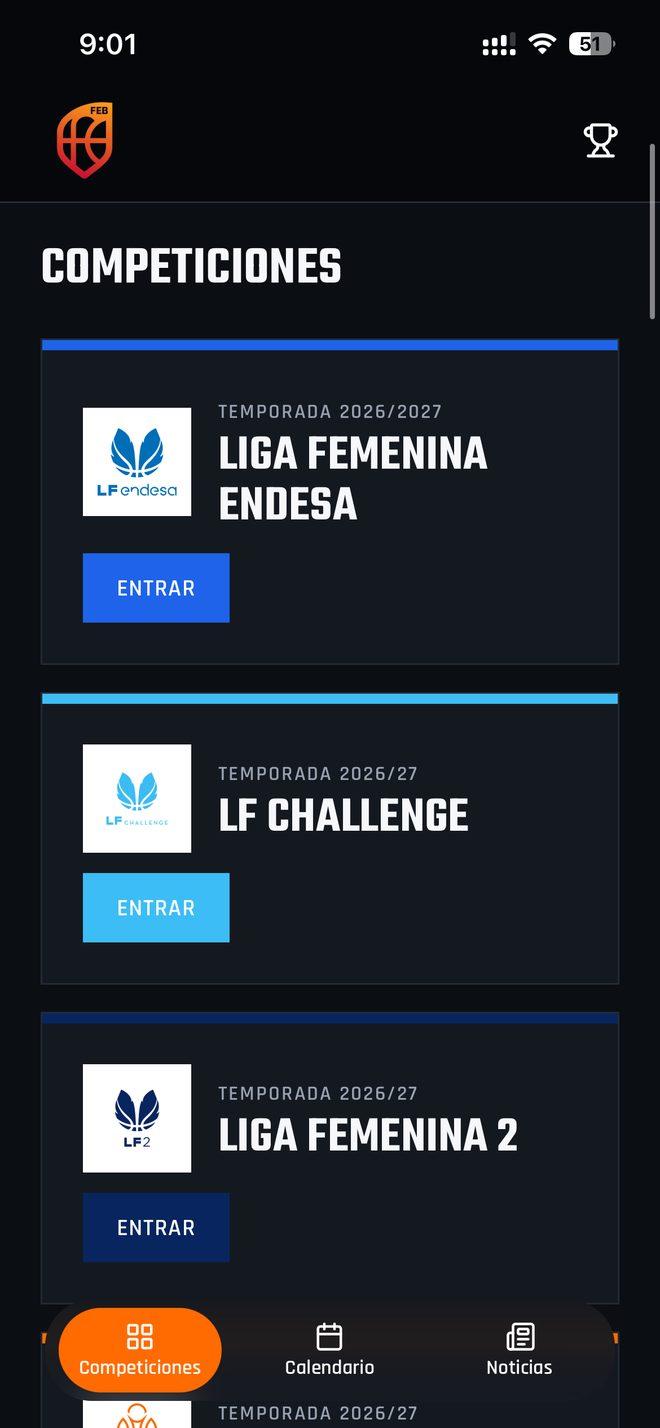
Beyond the aesthetics, the original platform made it hard for anyone who just wanted to watch a game.
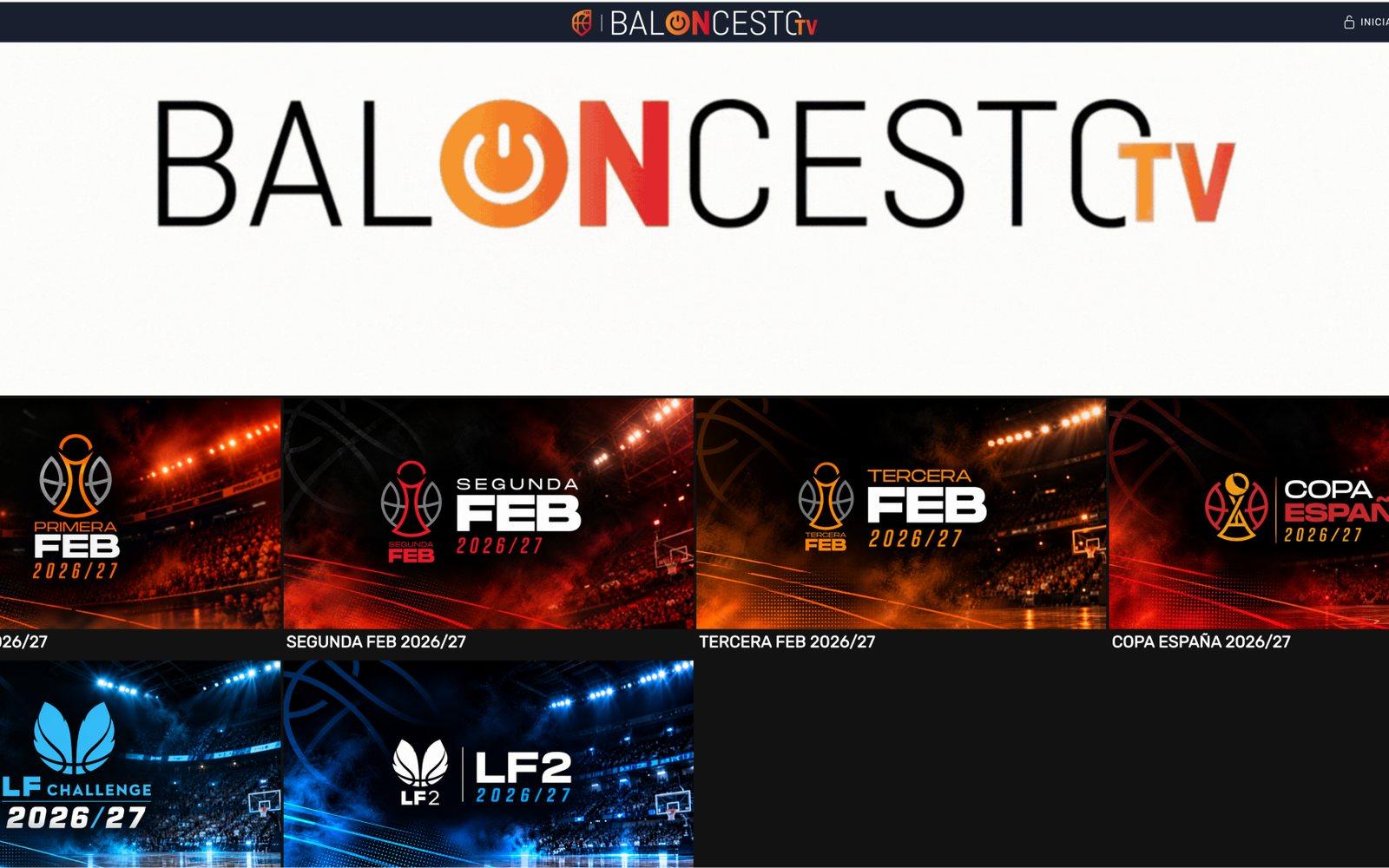
The brand ahead of the games
On desktop, the logo took up the first third of the homepage. On mobile, each section opened with a large header: an empty gradient.
You had to know where to look
The homepage showed competitions, not games. To get to one, you had to go into a competition and page through them 24 at a time.
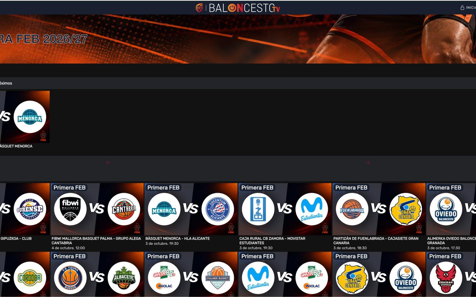
Hard-to-read cards
Both teams were on a single all-caps line, which wrapped or got cut off. And the card made no distinction between a live game and one starting on Friday.
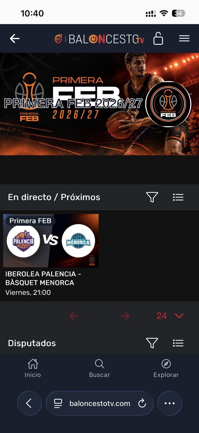
Unreadable titles
Outlined text on top of images, like “PRIMERA FEB 2026/27” over its own banner.
Empty screens in full view
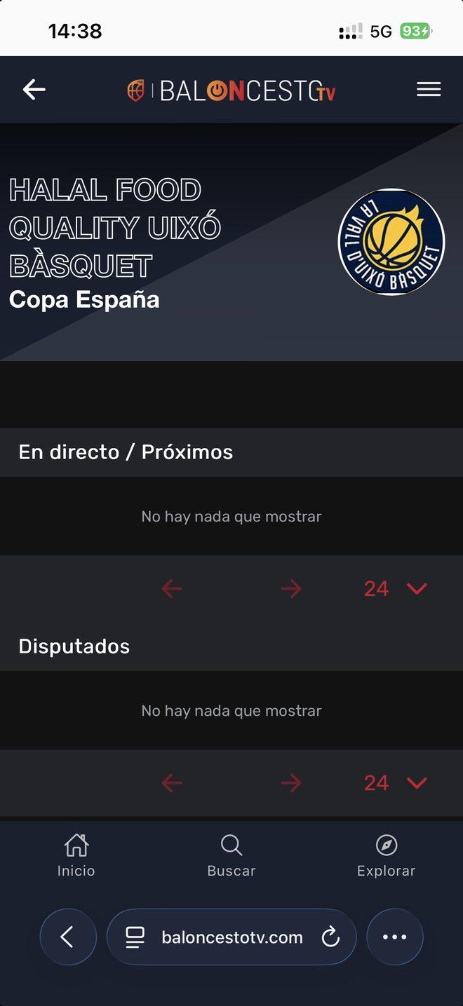
Whole sections saying “No hay nada que mostrar” (“Nothing to show”), with the pagination controls still showing.
My role
I designed the whole platform, for desktop and mobile.
The proposal
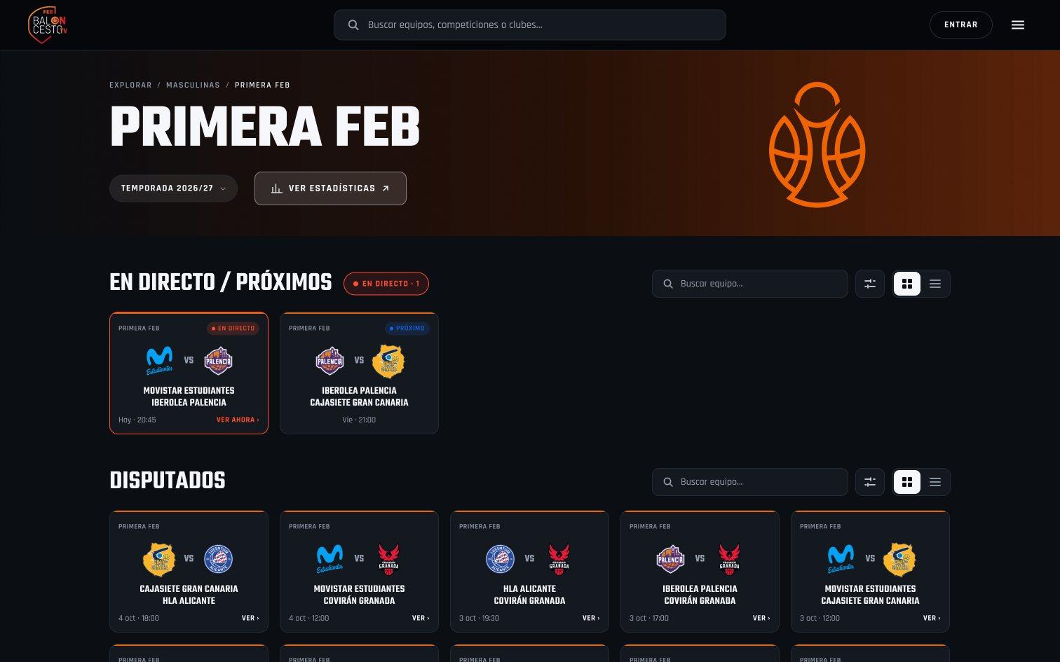
The first decision was to align the look with the competitions website. From there, everything else revolves around the game.
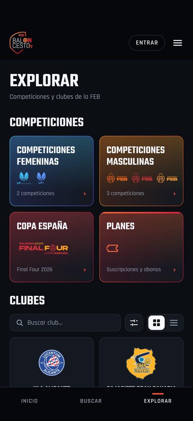
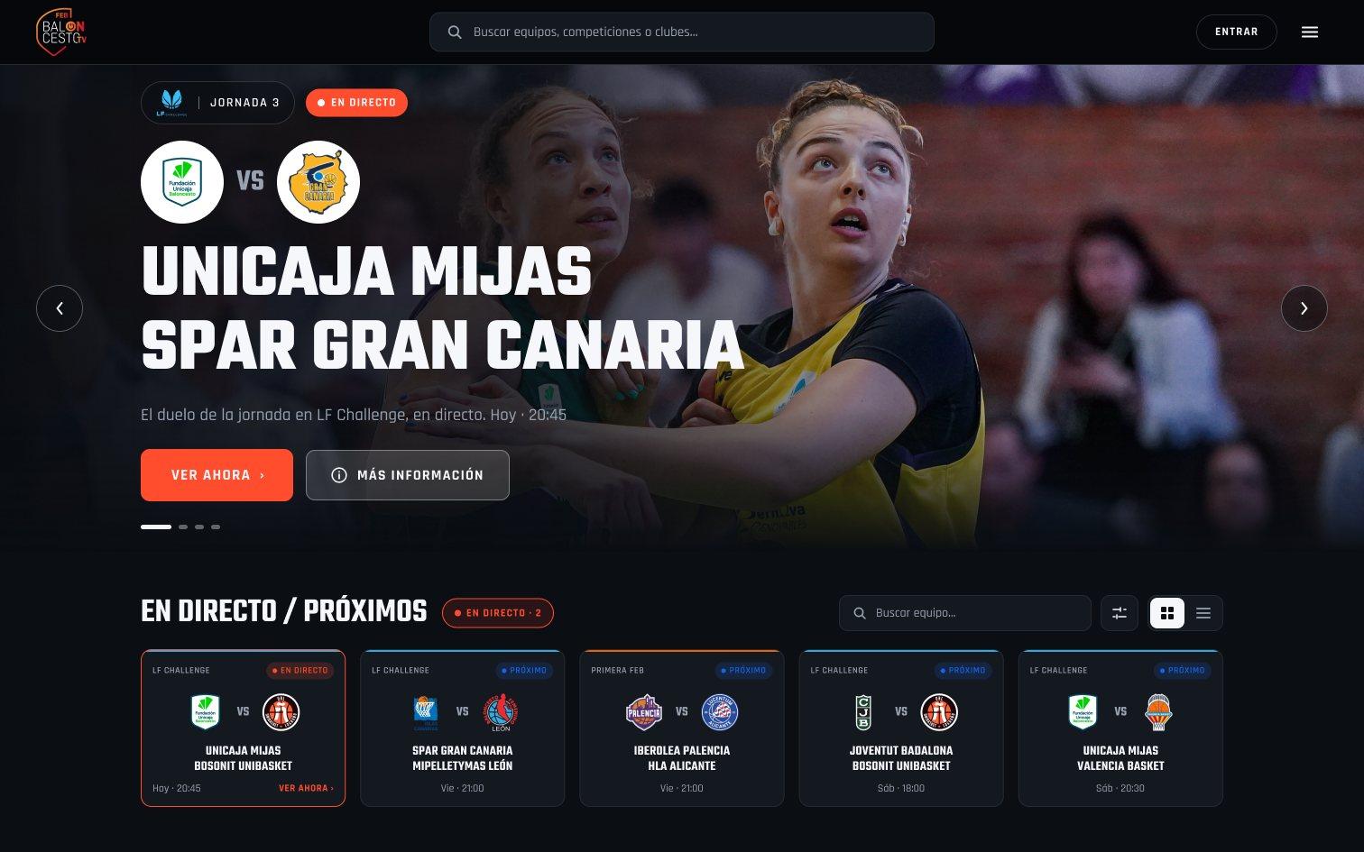
The game should be the first thing you see.
On the first screen, the brand and the competitions. Not a single game: to see one, you had to open a competition.
En directo / Próximos
Games first
As soon as you land: what's on now and what's coming up.
Cards you can read
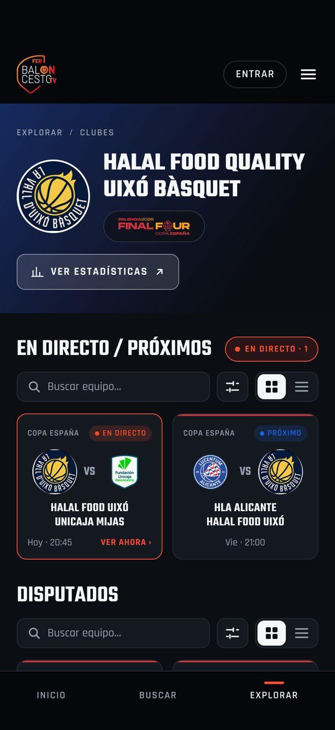
One team per line and, at a glance, whether the game is live or when it starts.
Find without navigating
A search bar for teams, competitions and clubs, with filters and a grid or list view.
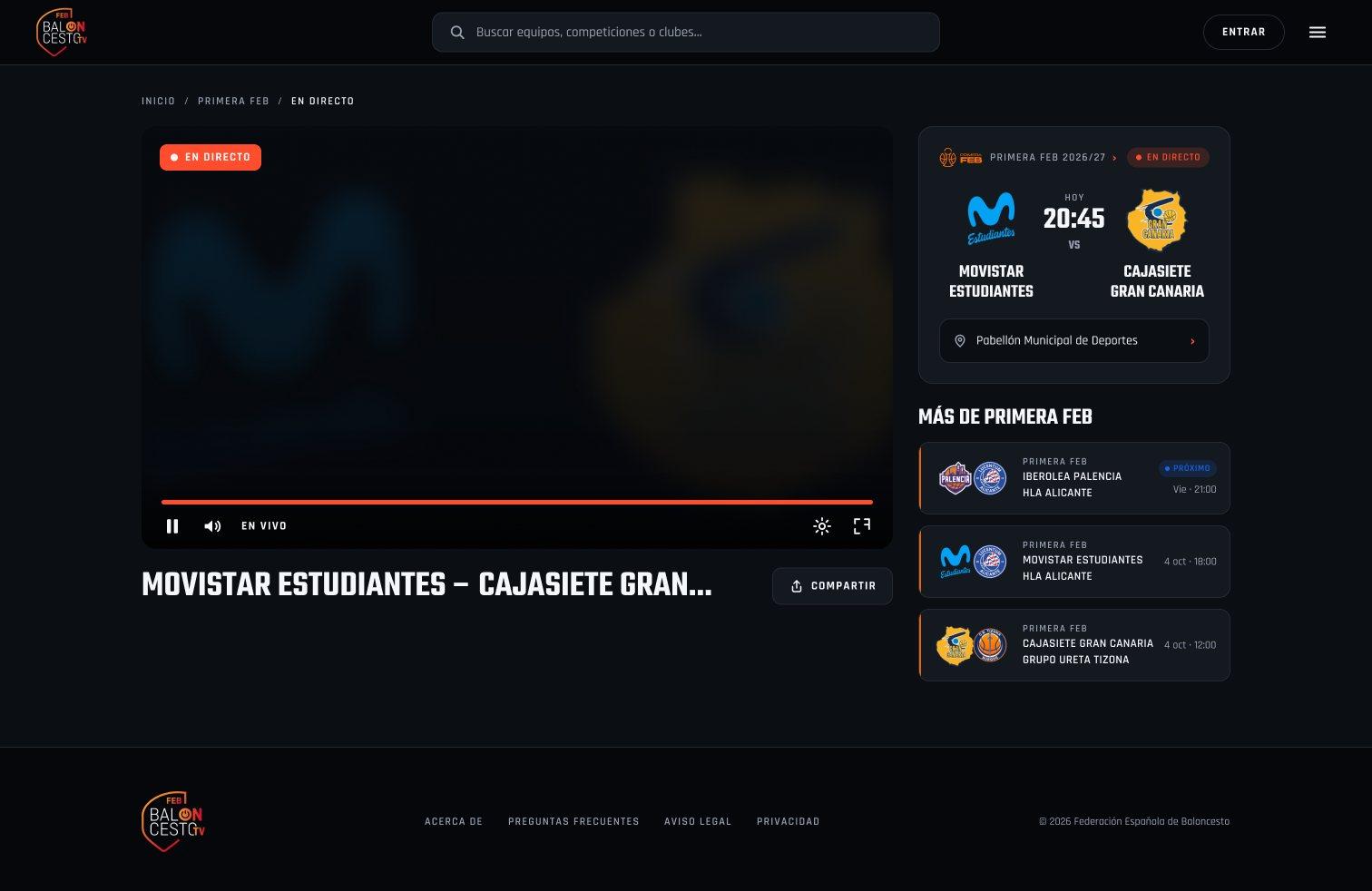
A video player with context
The game details, a countdown if it hasn't started yet, and more games from the same competition.


Iberolea Palencia - Cajasiete Gran Canaria
Viernes, 21:00
- Both teams on a single uppercase line that breaks or gets cut off.
- No difference between a live game and one that starts on Friday.
Before
After
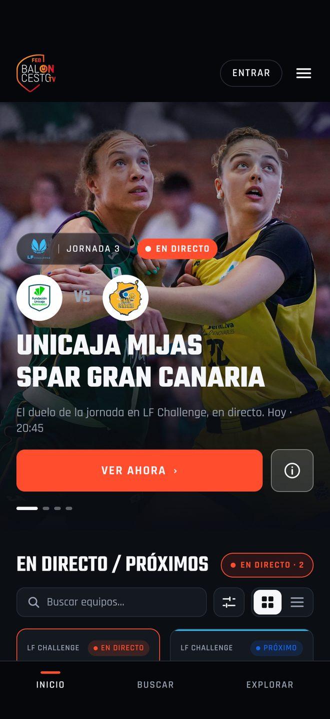
On mobile
Every desktop screen has a mobile version. Three of them, before and after:
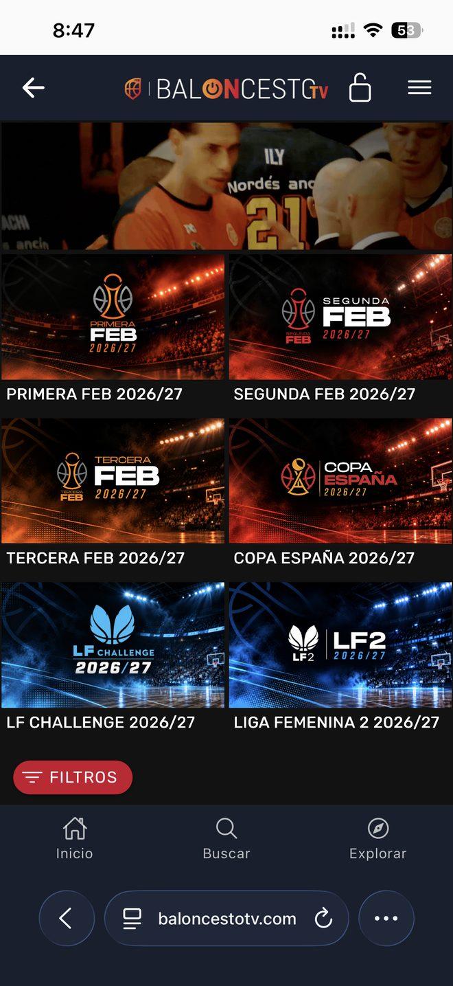
Home
Instead of competition banners, a featured live game and the button to watch it.
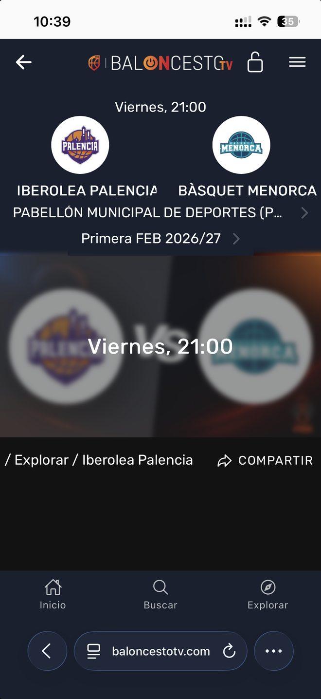
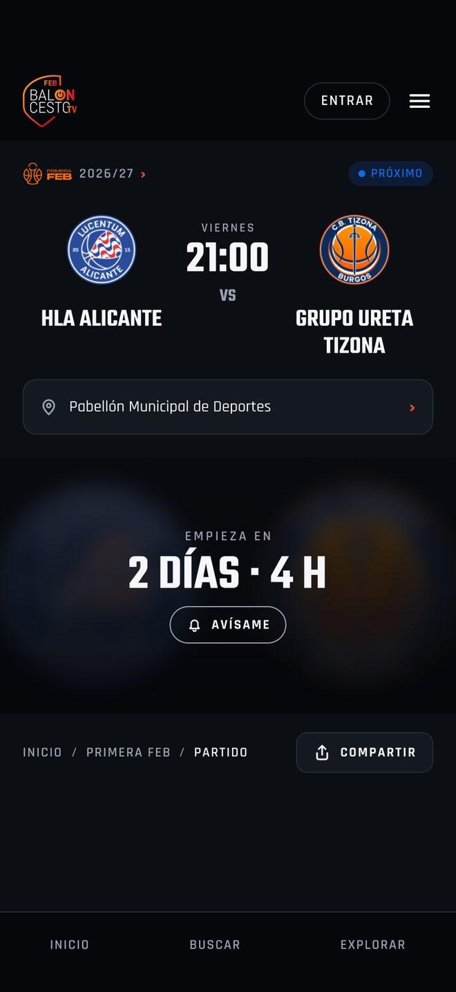
Video player
The time no longer sits on top of the blurred crests: the game details and a countdown with a button to get notified.
Team
No empty sections: its crest, its competitions and its games.
Results
A complete proposal
Every screen, with the same visual style as the rest of the FEB's products.
Presented to Sportway
By the FEB, for them to develop.
Let's talk.
I can walk you through any of these projects in more detail, including the screens I can't publish here.